Menu
Close
Rebel Reads is a Copenhagen book club for people who love good literature. Its meetings happen offline: members read together, recite poetry and talk about books over good coffee. The client wanted a brand that breaks away from the typical "girly" look of book clubs and makes it clear that men are welcome too. They also needed a punk identity the owners could run themselves, without a designer.
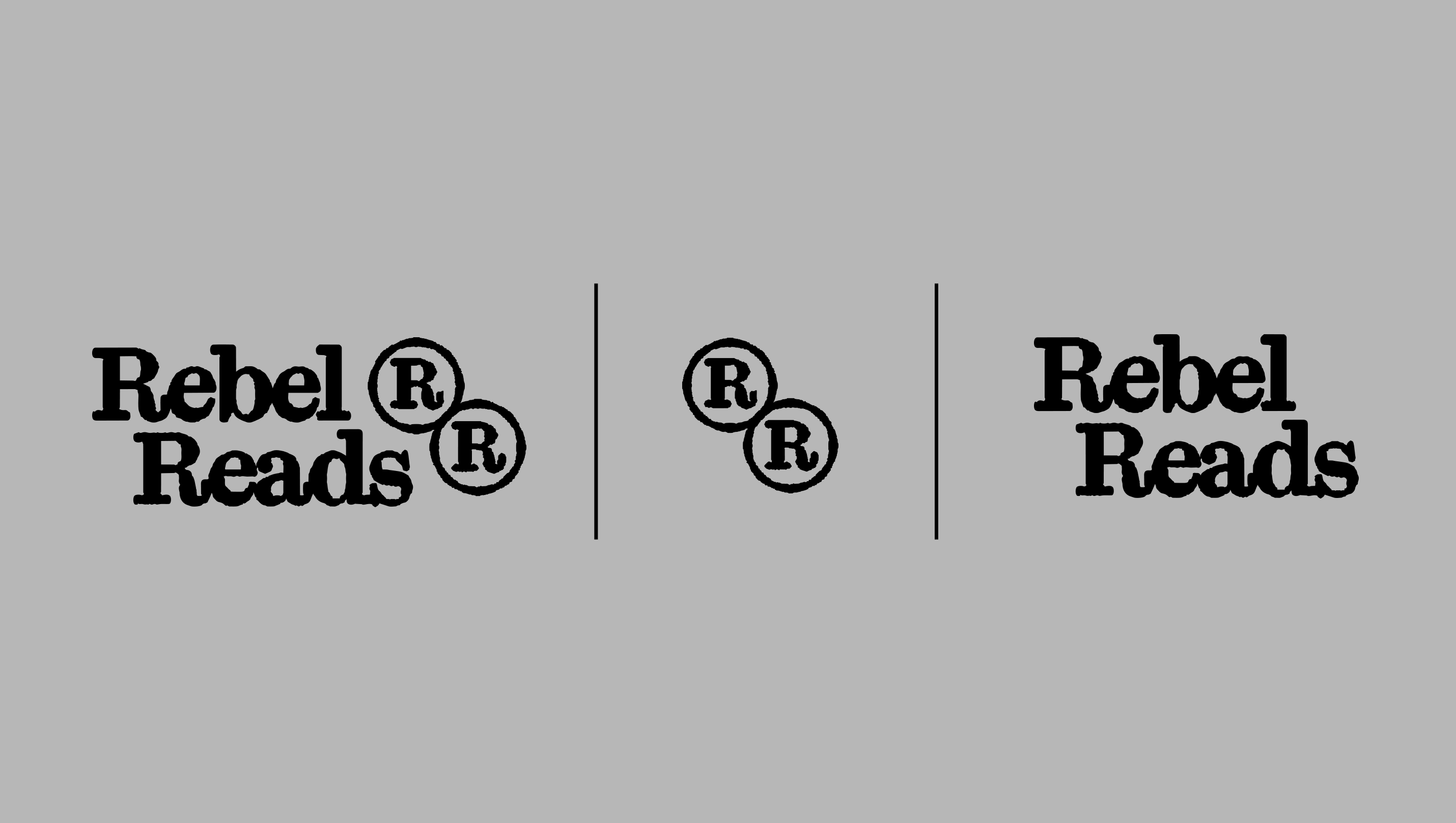
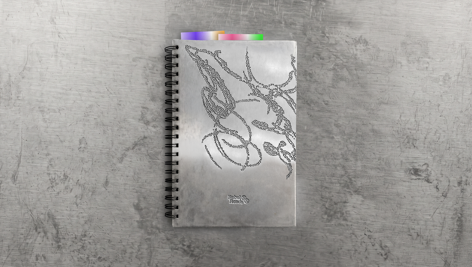
The identity is rooted in analogue work, stamps and offset experiments that echo the feel of reading a printed book. We based the logo on ex libris stamps, the historic marks owners used to label their books. The merch features Copenhagen symbols such as the lions from the city's coat of arms and an old city seal. They are set against scribbles, imperfect illustrations and tribal patterns. Every visual sits on one of a set of defined gradients, which changes with the size of the format.
The Kyoto typeface refers to classic book serifs. Headlines are set with minimal tracking and leading: letters touch and lines may slightly overlap. The owners create images themselves in a web app. They upload a photo, the app applies the effect, and they simply download the result and add typography for a post or a poster. Anyone can create a new visual, and the brand keeps a consistent look.