
Menu
Close
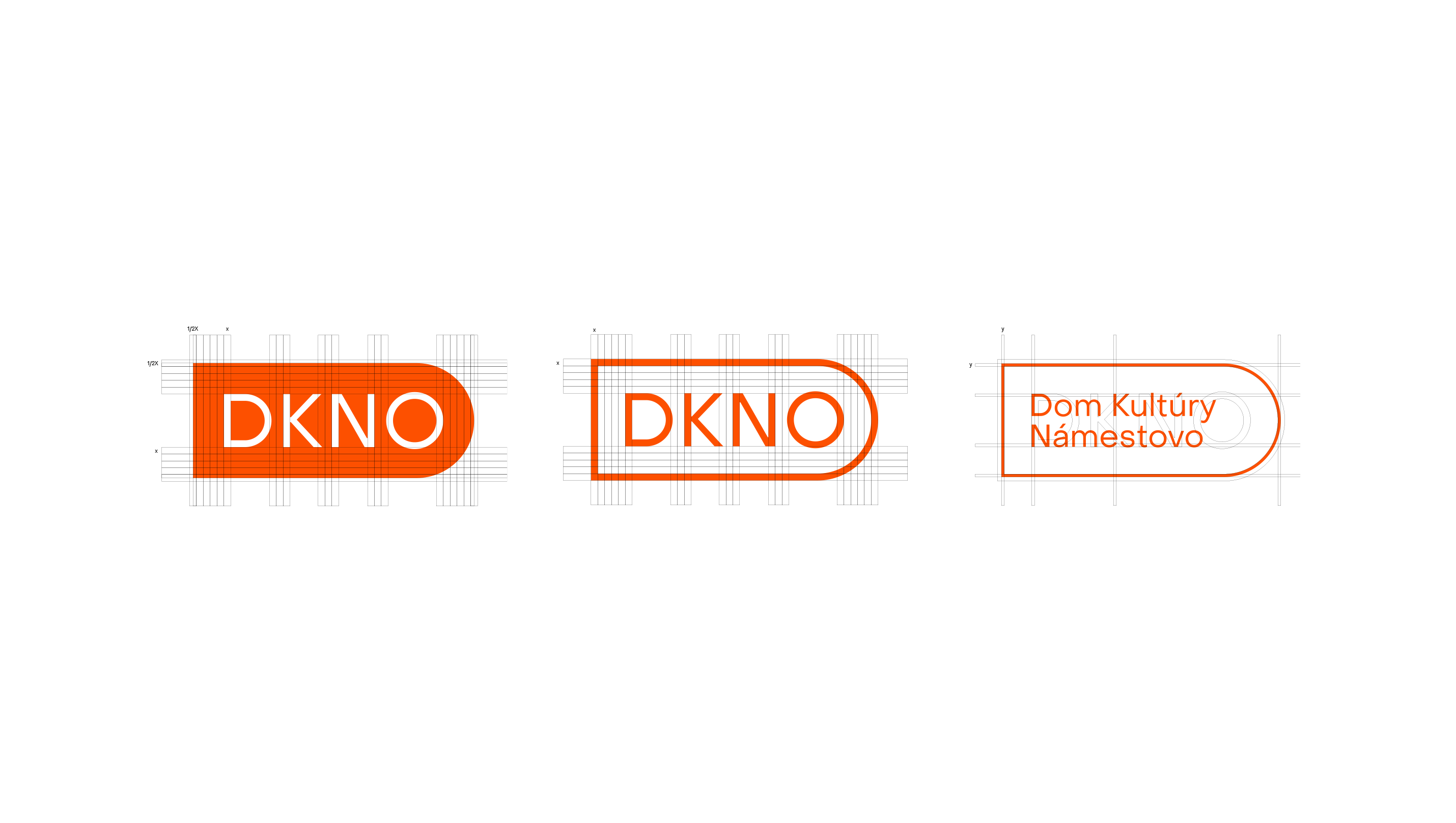
The House of Culture in the town of Námestovo is the cultural hub of Orava, a region in northern Slovakia. Its functionalist building is home to a cinema, a library, a large theatre hall and a smaller stage, as well as one of Slovakia's most successful amateur theatre companies, which has represented Slovakia in Miami.
The programme is rounded off with talks, talk shows and events for children and adults. Almost every Slovak village has a house of culture, but the one in Námestovo works at a professional level that its communication had long struggled to keep up with. Our task was to bring the brand up to the standard of the culture it offers.
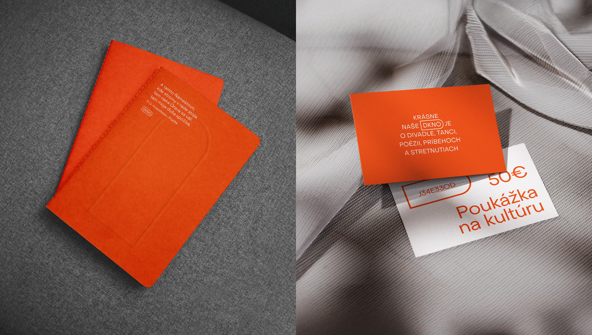
Two members of 204 come from Námestovo, so we have known the house of culture since childhood. We went through a series of strategy workshops and meetings, asked a lot of questions, and sat and talked with the people who work there. We have even organised several events there ourselves. We know the processes, the team and the communication challenges between the institution and the people of the region.
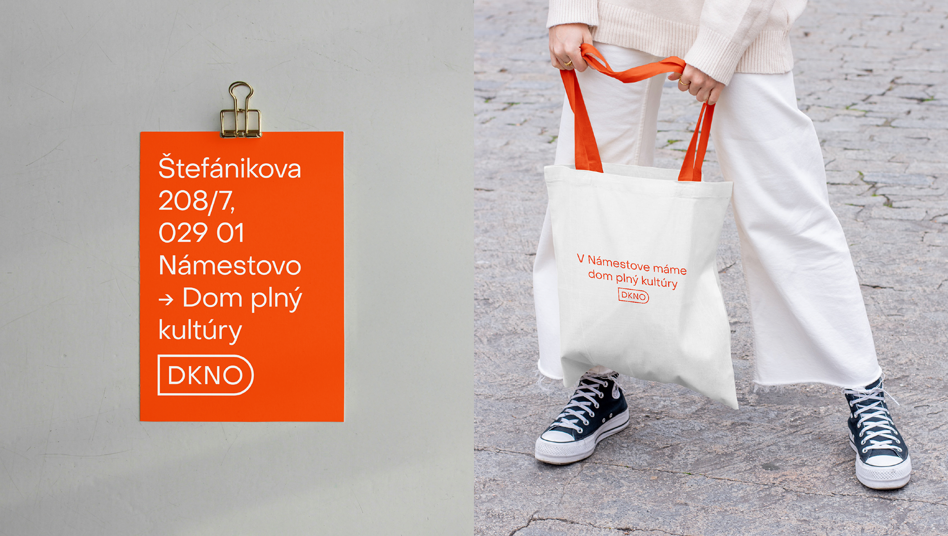
So above all, the identity had to work in practice, in a cultural sector that is often short of both time and money. The simple functionalist logo echoes the architecture of the building. We build on the abbreviation DKNO, which people already use in everyday speech, to make the path from first glance to recognition as short as possible.
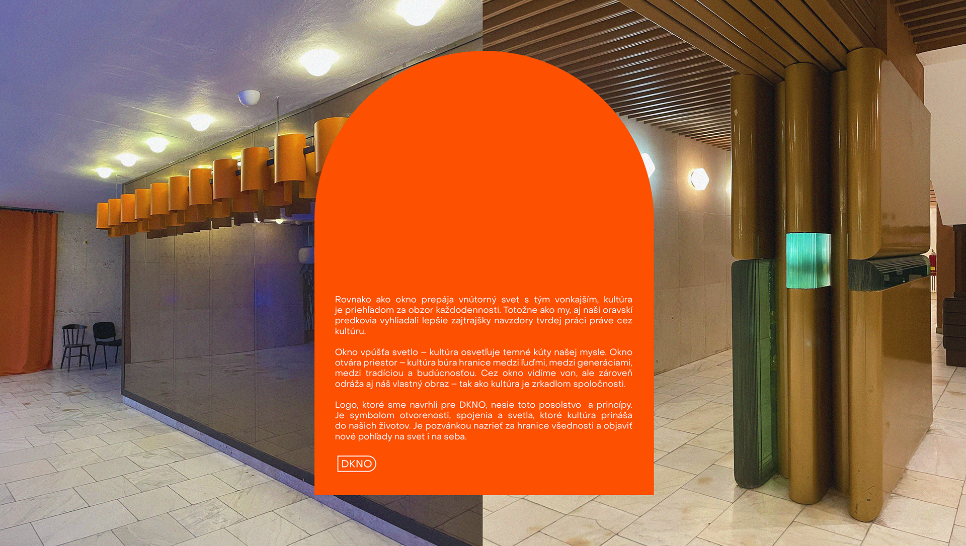
We wrapped the entire identity in a single colour. We found the orange while touring the original interiors, on the lamps and fittings that have always been part of the building.
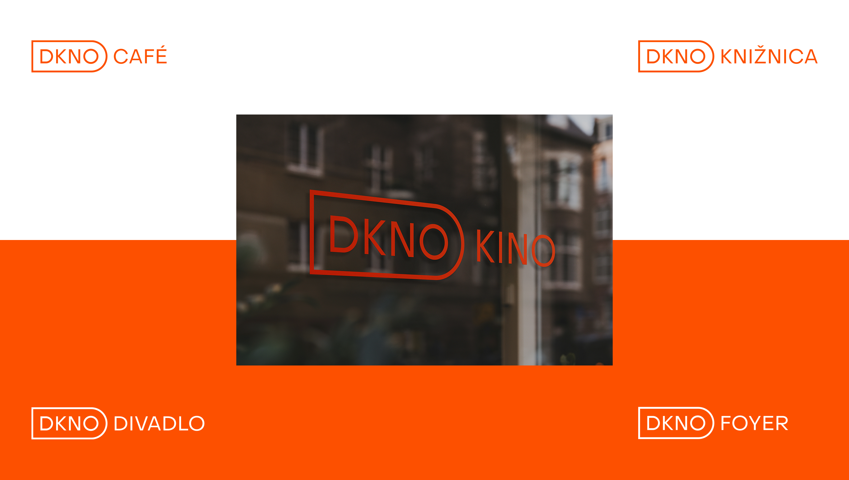
DKNO brings together many spaces and parts, from the library and theatre to the cinema. That is why we built the brand architecture as a branded house.
The logo works as a modular system that communicates each space or part of the building under a single header: DKNO kino (cinema), DKNO foyer, DKNO javisko (stage). Each part stays recognisable, yet always links back to one brand in people's minds. Orange ties it all together.
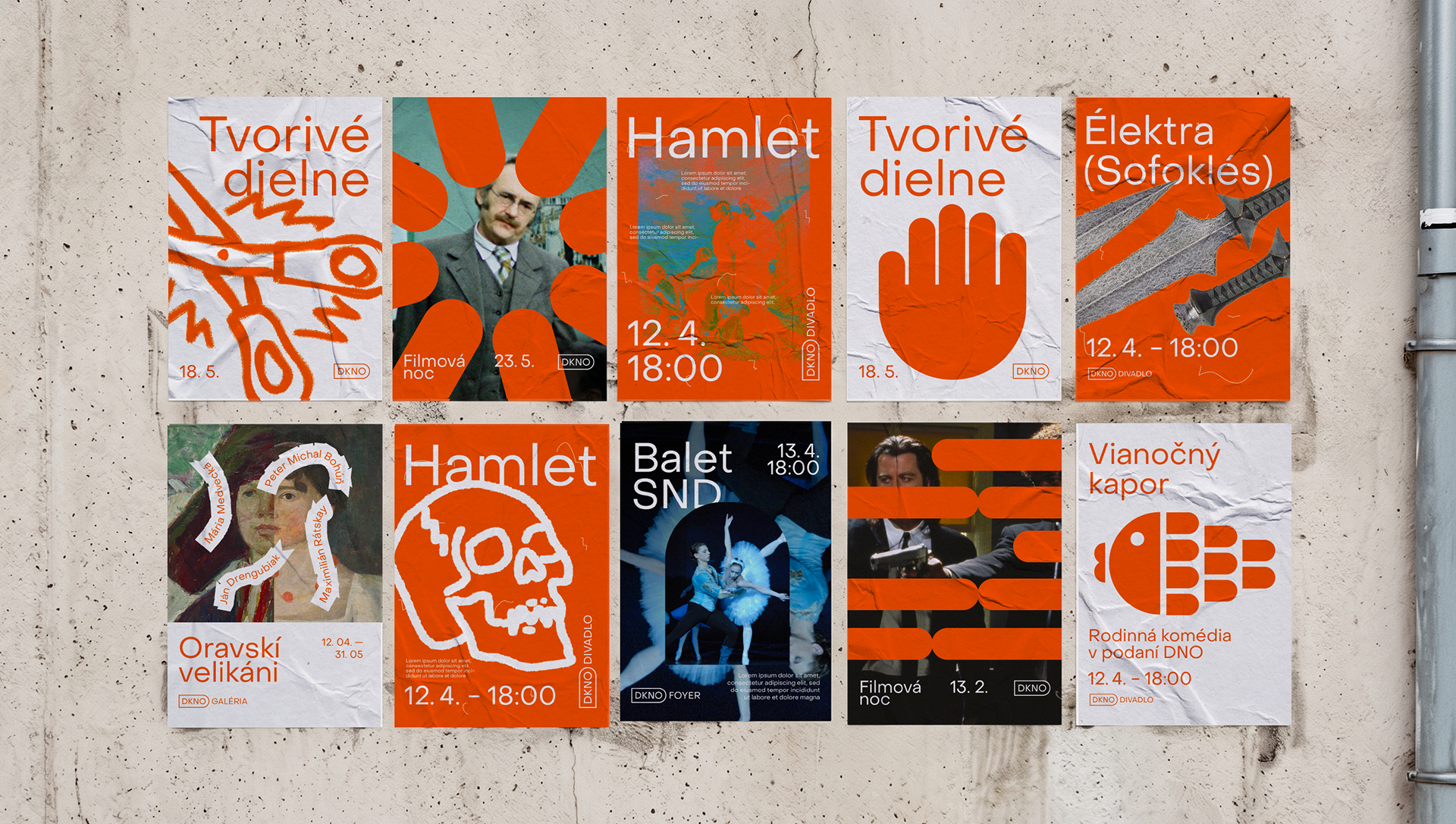
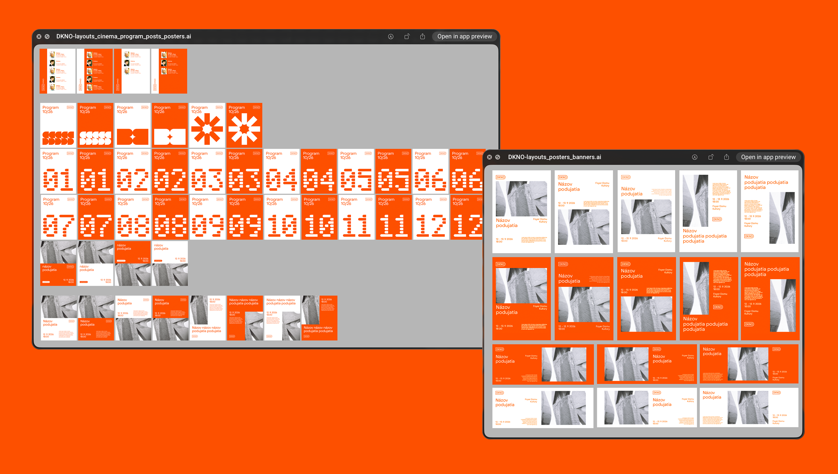
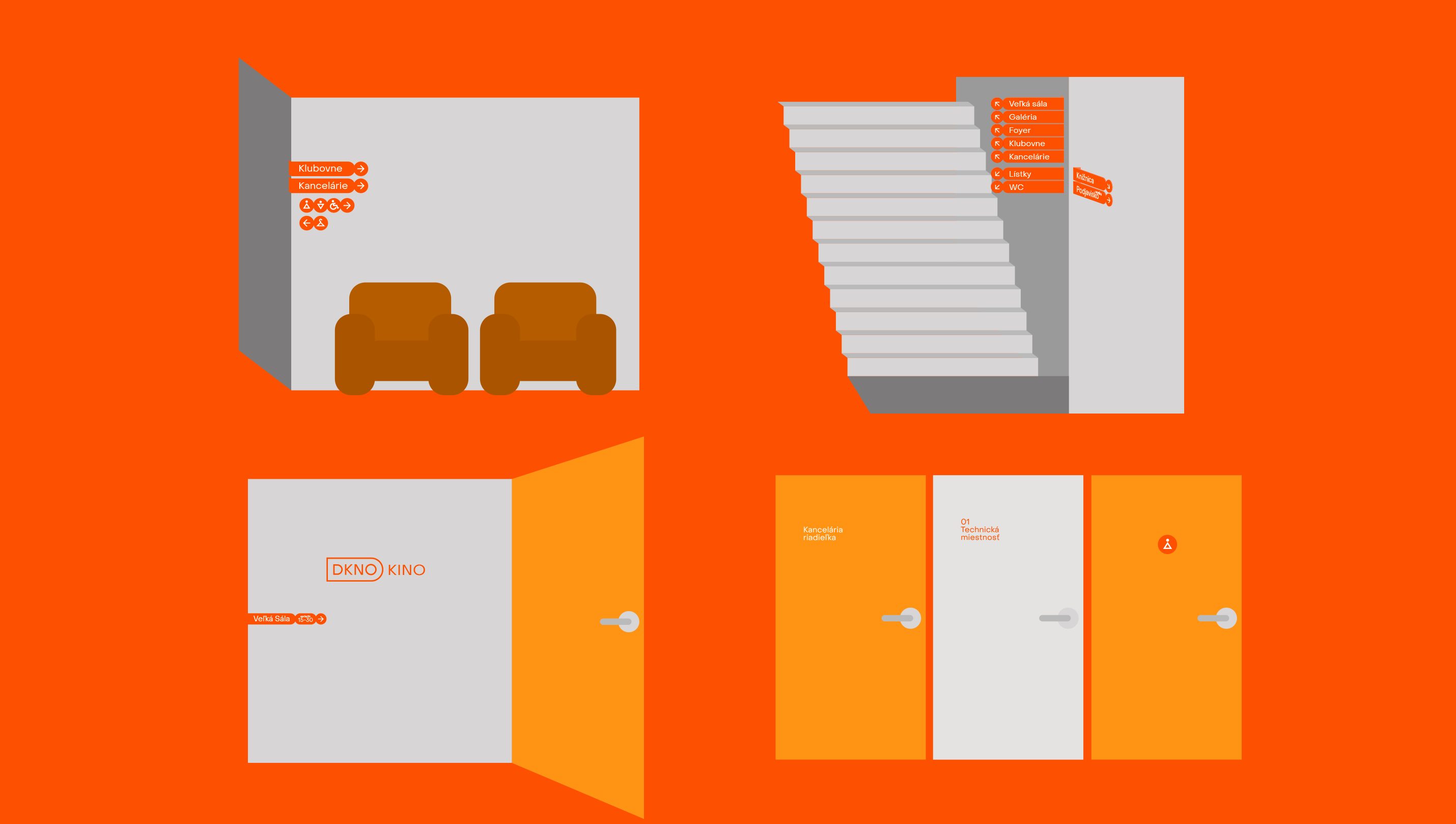
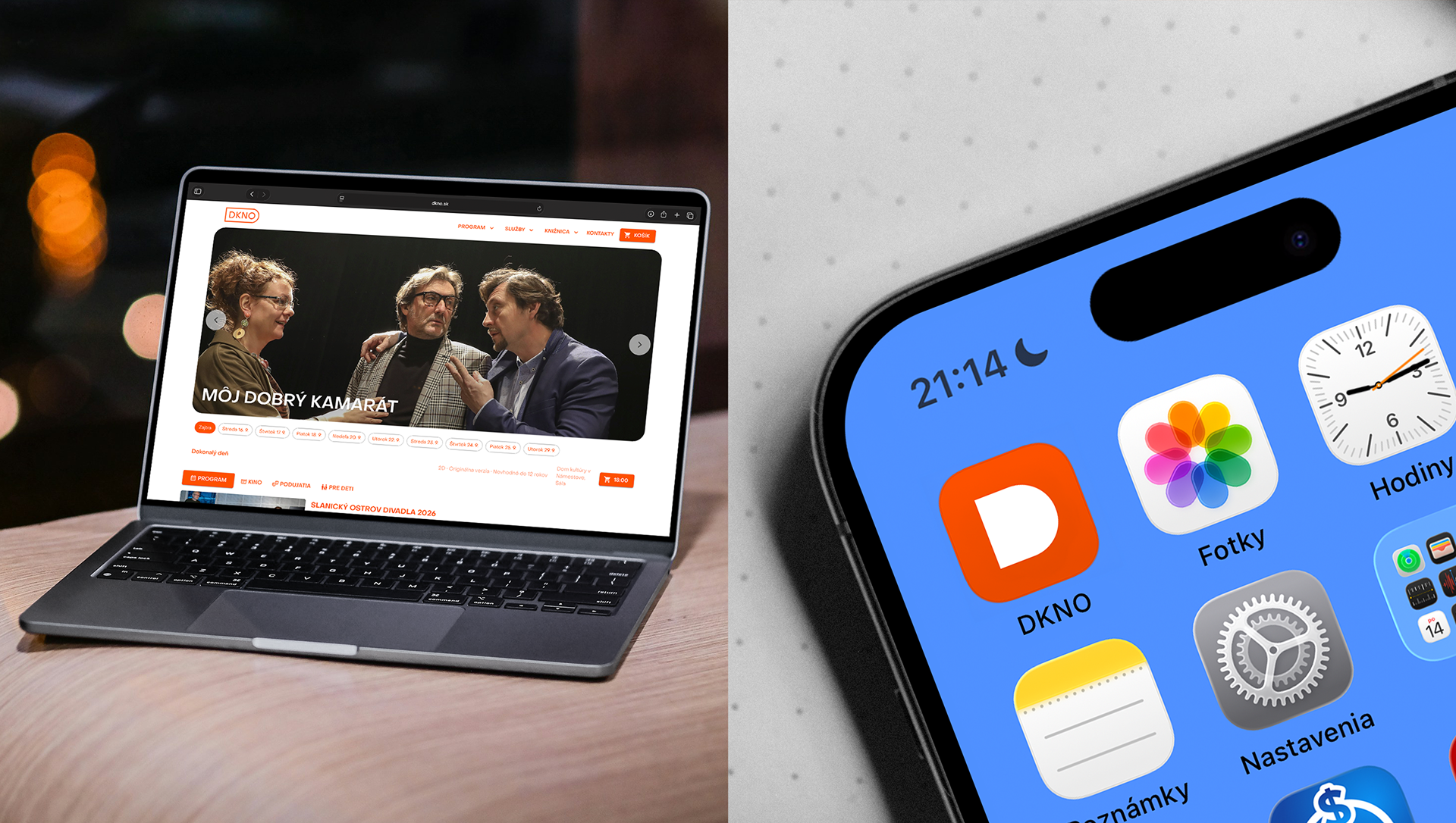
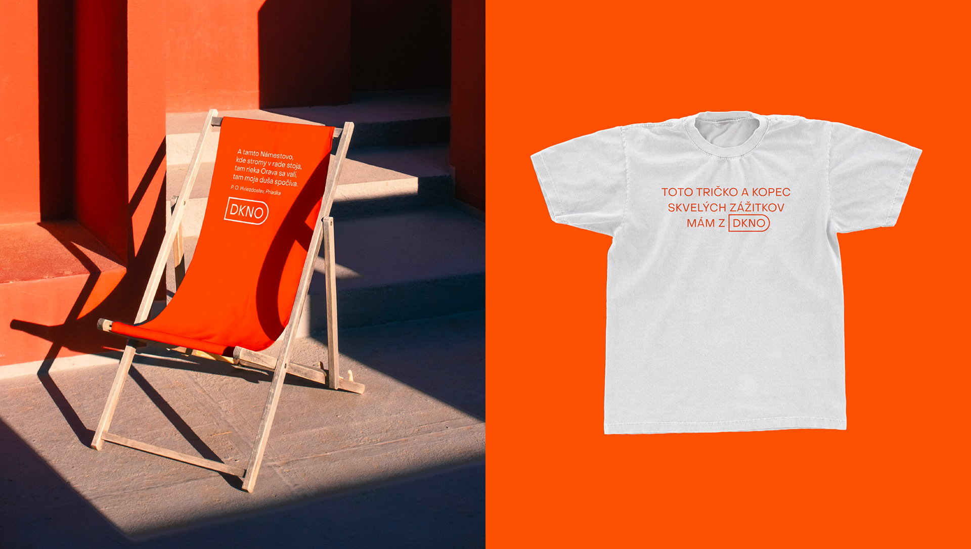
For the layouts, we followed one motto: Simplify first. Cultural institutions make most of their visuals themselves, so we wanted to cut the time the team spends on a post, a poster or a roll-up banner. The layouts are simple, yet built on careful composition and quality typography, and the orange makes them recognisable at first glance. The system has three levels. At the simplest, you swap the photo in the mask, rewrite the text, and the visual is ready for Instagram or the front window. More creative visuals are handled by staff, with whom we held a workshop. The most advanced layouts are defined for a graphic designer, and we design those ourselves. DKNO can choose the route depending on time and importance, and the visual language holds together even on a limited budget.