Menu
Close
For more than six years, Nikita and Vítek have been talking openly on the award-winning podcast Love Is On the Air about topics people rarely discuss. The common thread is always love, both physical and emotional. Over that time, the podcast has built one of the most loyal communities in the Czech Republic. When it decided to step out of the studio with merch, live shows and events, it turned out that apart from its name, it had no brand. The challenge was to find a way to show risqué topics with the humour and honesty the podcast is known for.
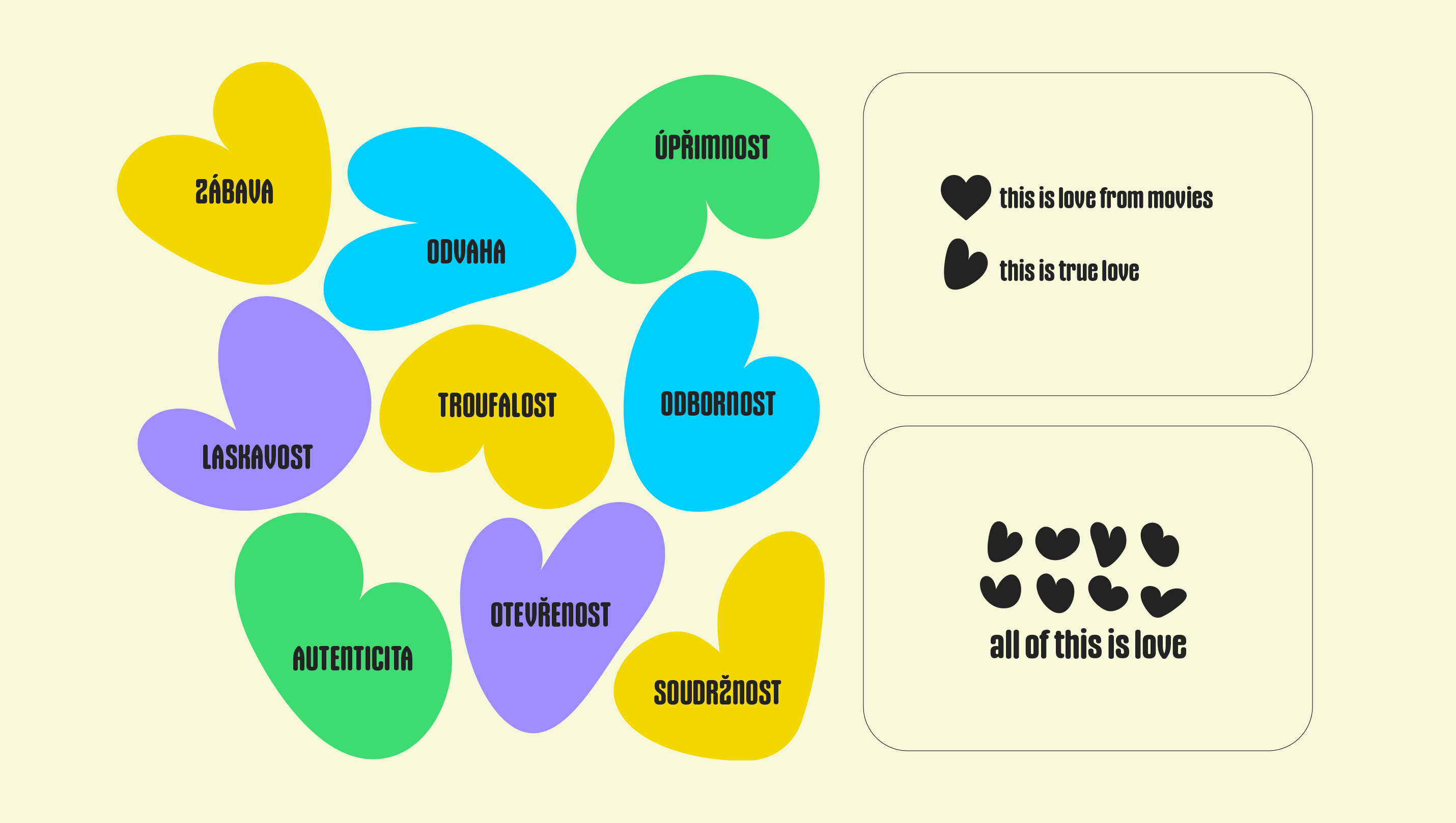
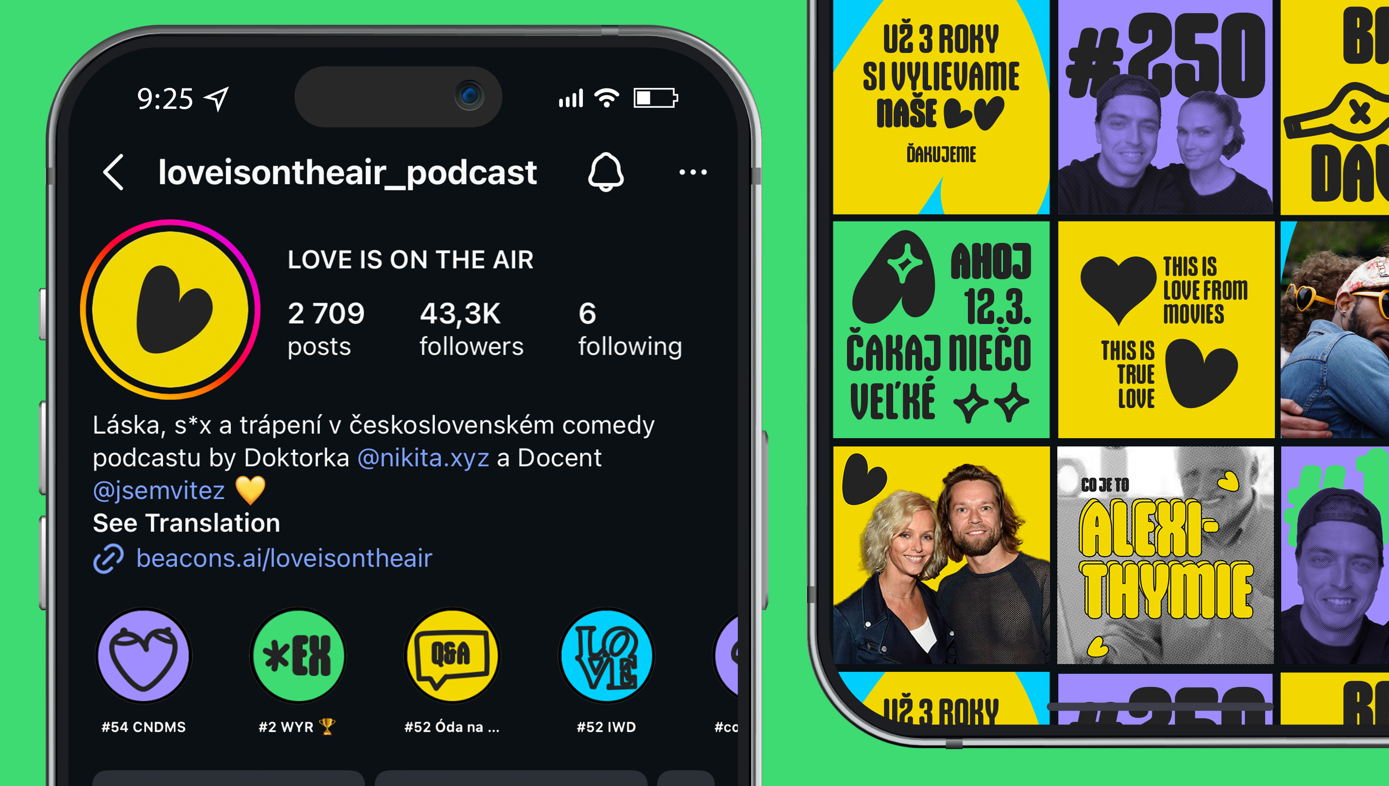
The logo is a simple, imperfect heart that also reads as the letter L. Love in films and songs tends to be idealised, but real love is imperfect, unpredictable and comes in a million forms. That is exactly the kind of love Love Is On the Air shows as it maps people's real stories without embellishment.
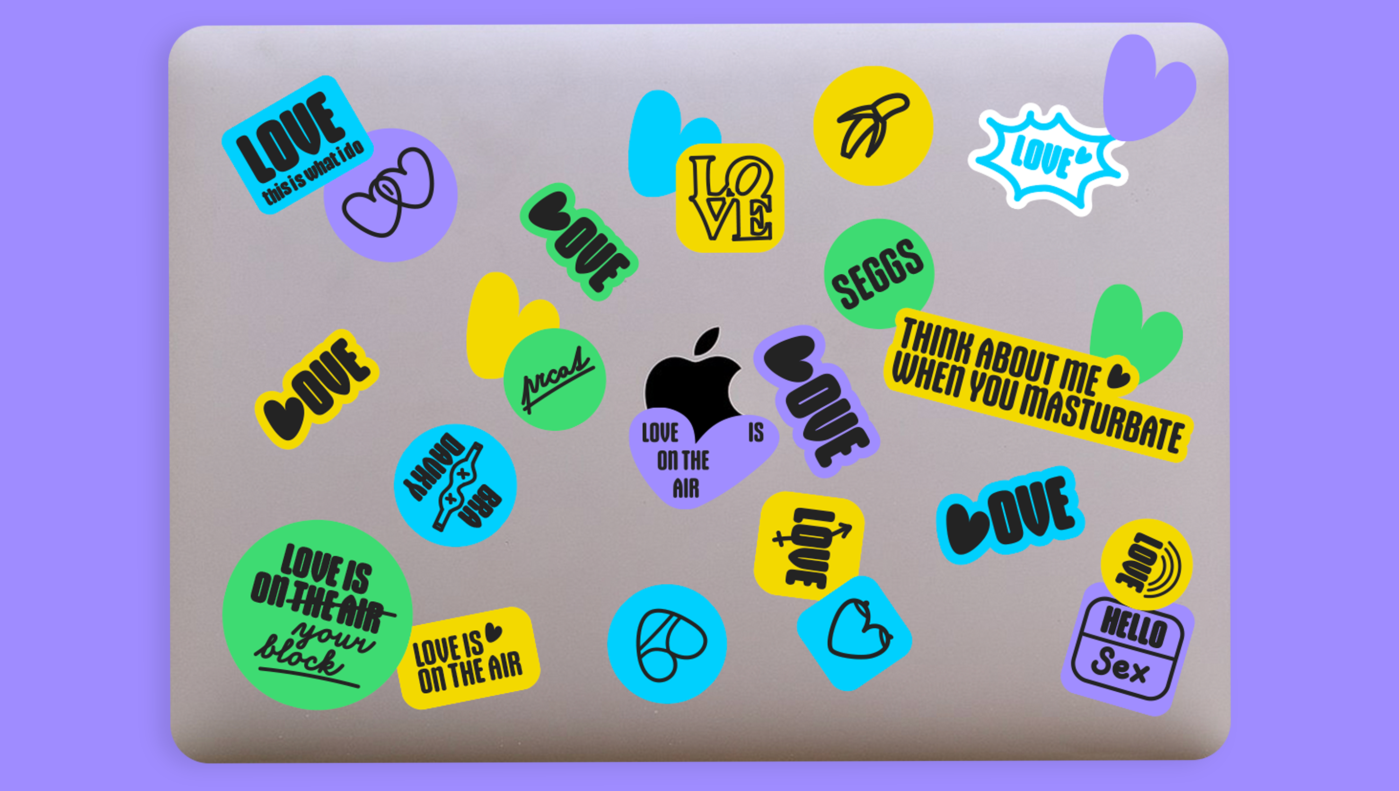
The heart is an easy-to-grasp symbol that can be extended with other shapes built on the same principle.
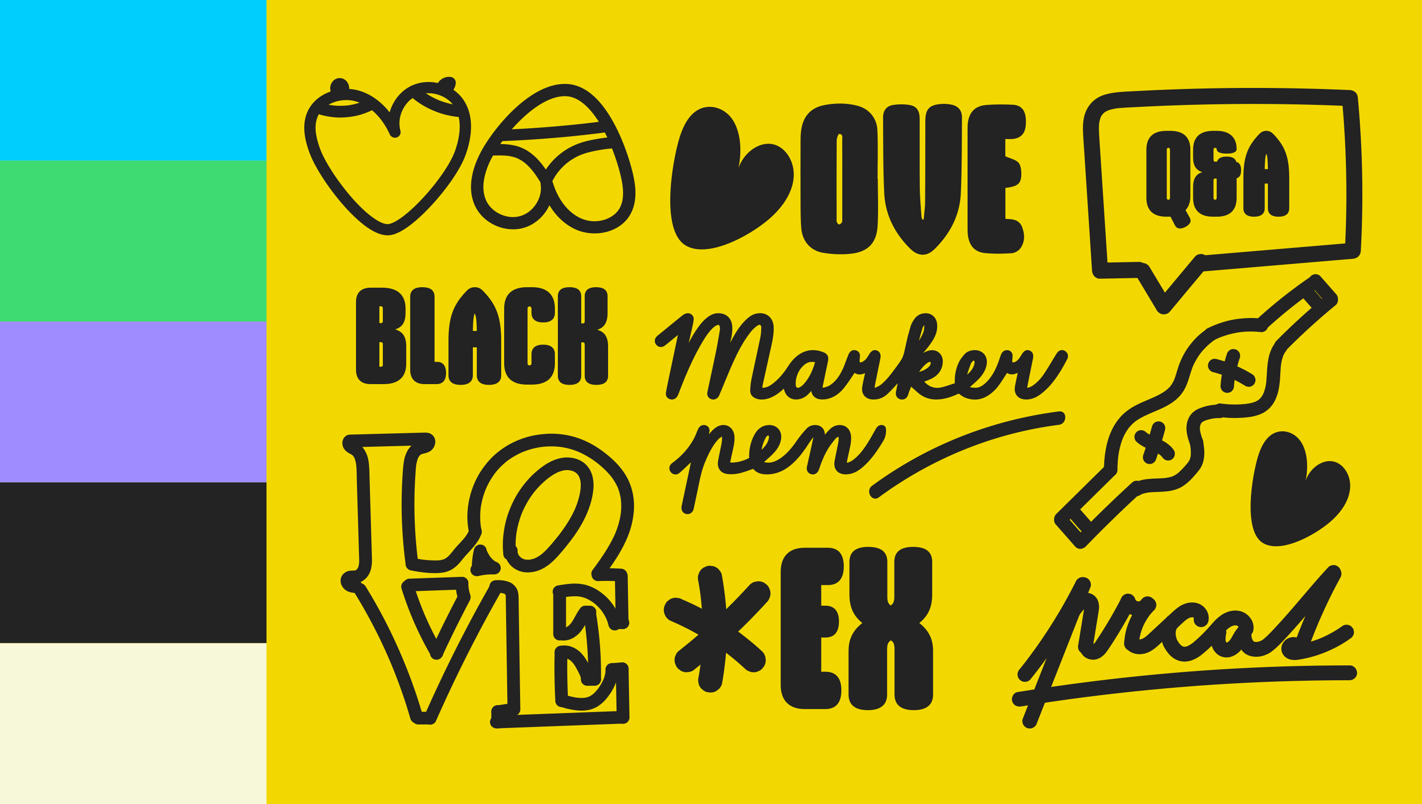
We turned the yellow the podcast was already using into the backbone of all its communication. It is complemented by secondary colours that contrast well with the black typography and illustrations.
A bold all-caps typeface pairs with the logo, while a supporting font handles longer texts. The illustrations are built on a "marker pen" aesthetic inspired by Keith Haring's simple drawings. The visuals are minimal and texture-free, letting the joke, the play of colour and the imperfect brushstrokes stand out.
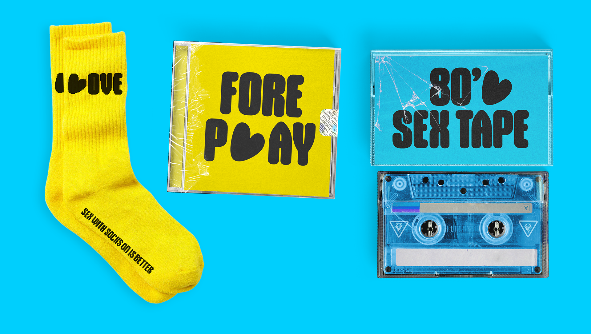
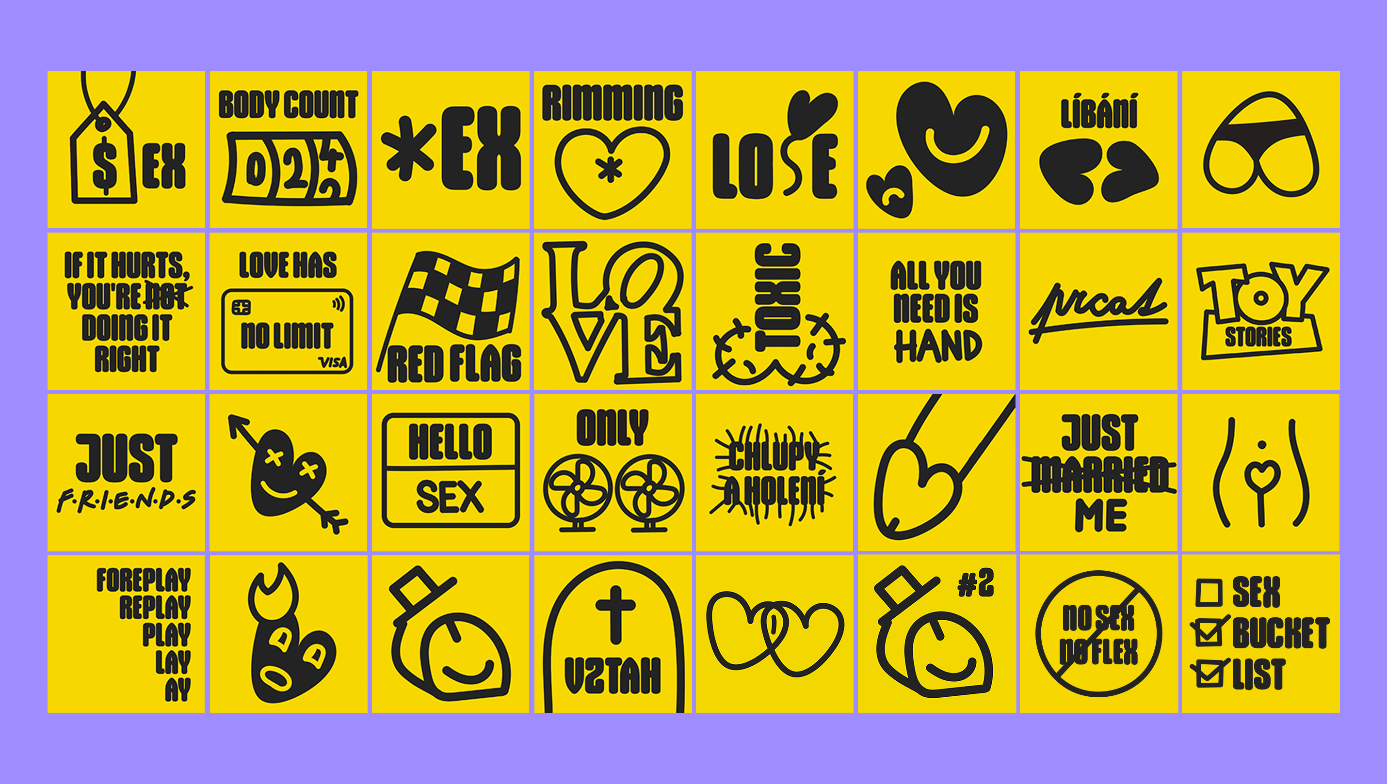
The toughest task was the episode covers on Spotify. Explicit topics can't be shown in a photo, so every episode has its own artwork, which we still create to this day. We work with deliberately limited means: a yellow background, a black marker and a few lines of text. Pop culture, wordplay and observations about dating, love and sex spark an idea the listener gets in a second or two, and laughs. A cover should always be kind and honest, sometimes downright cheeky, other times surprisingly spot-on. Even after more than 250 episodes, we still enjoy it, and so do the fans.
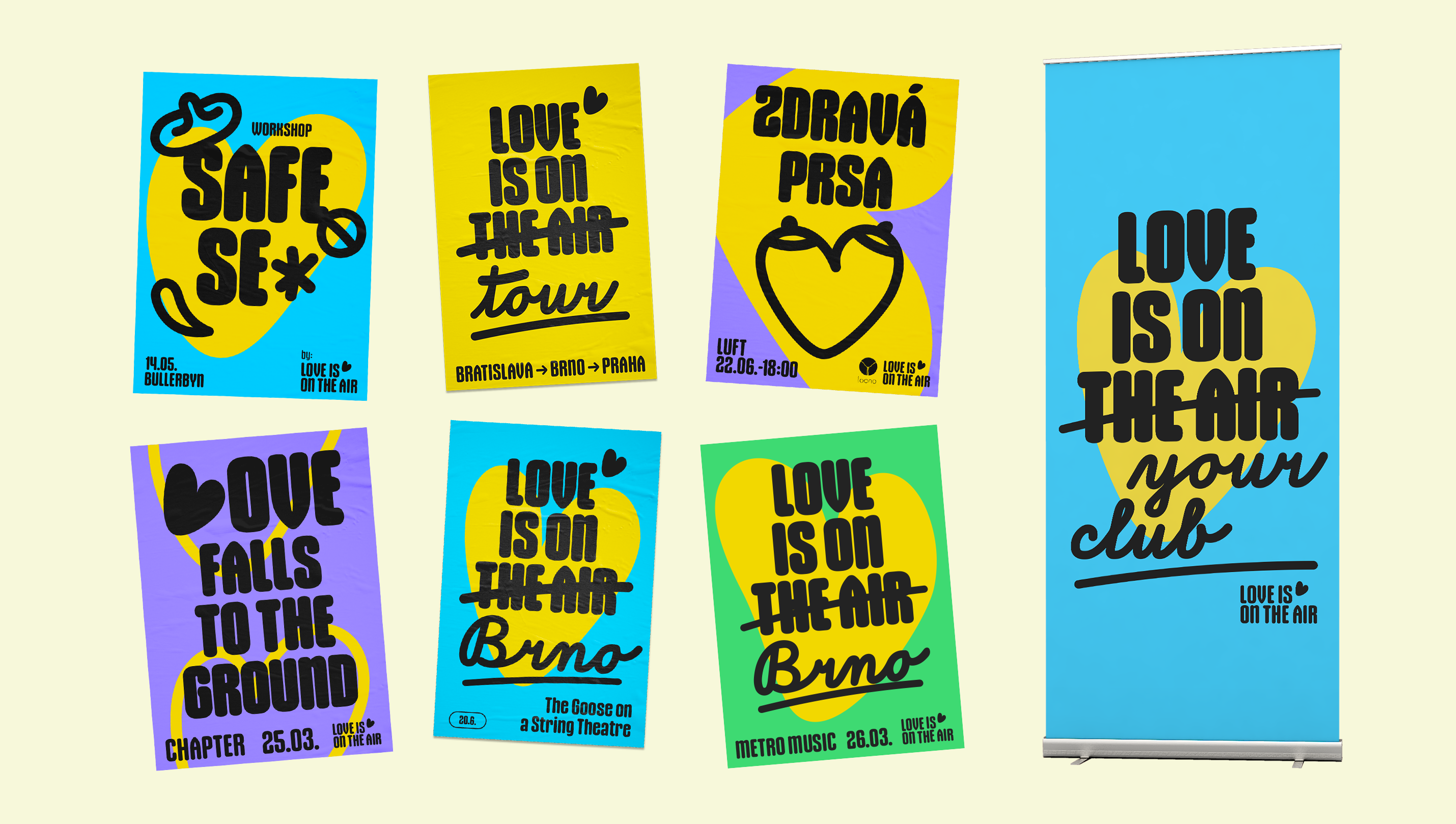
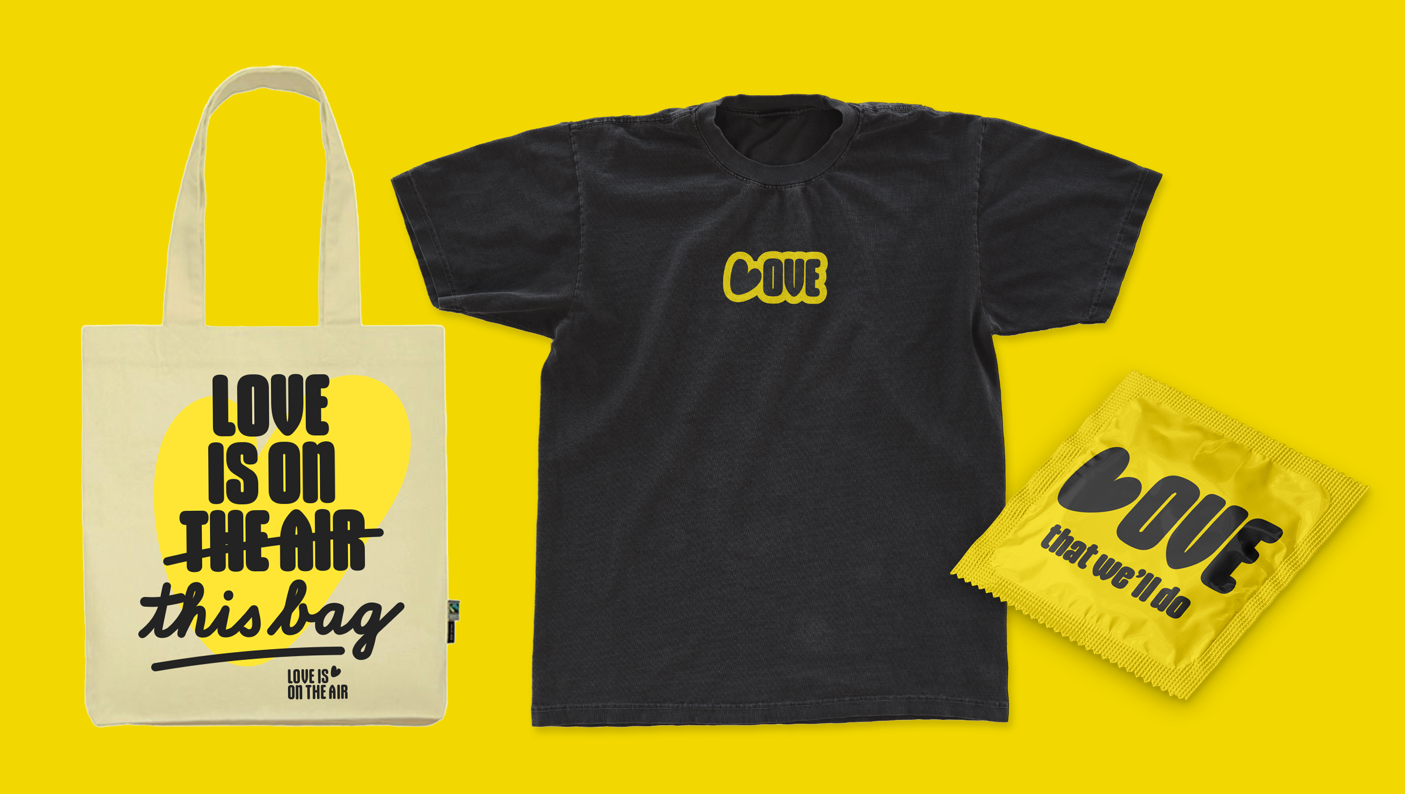
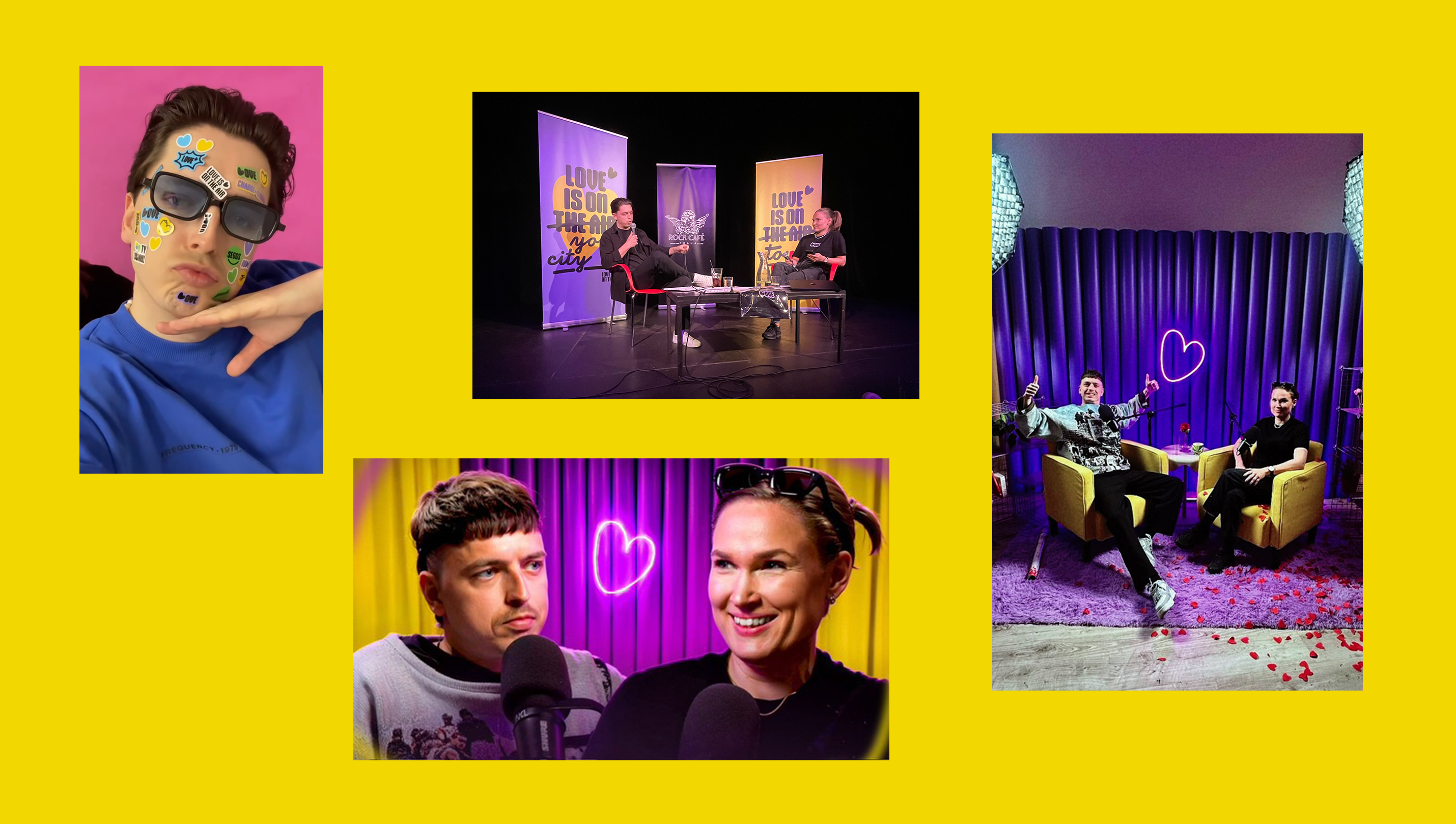
The identity had to work both online and offline. For the tour, we produced posters and roll-ups, T-shirts, stickers and LOVE merch in which the heart from the logo replaces the letter L. The whole system is held together by a simple creative concept. For more than three years, the identity has stayed consistent, people link the brand directly to the heart, and Love Is On the Air is now one of the most recognisable podcast identities in the Czech Republic.