Menu
Close
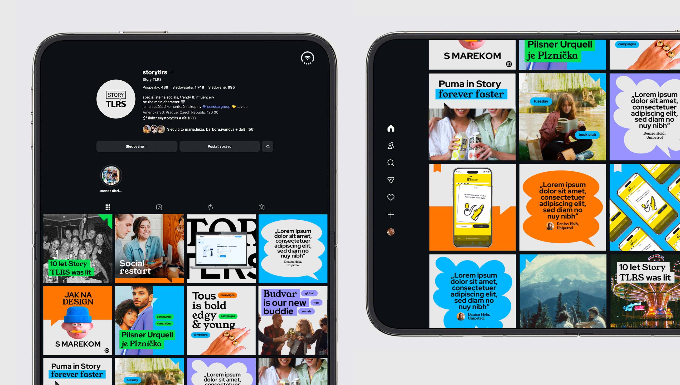
The identity grows out of the brand's DNA, storytelling, and out of the most basic symbol of communication, the speech bubble. At its core is a clean layout with bold black typography set on the grey of operating system windows, which builds trust and references digital interfaces.
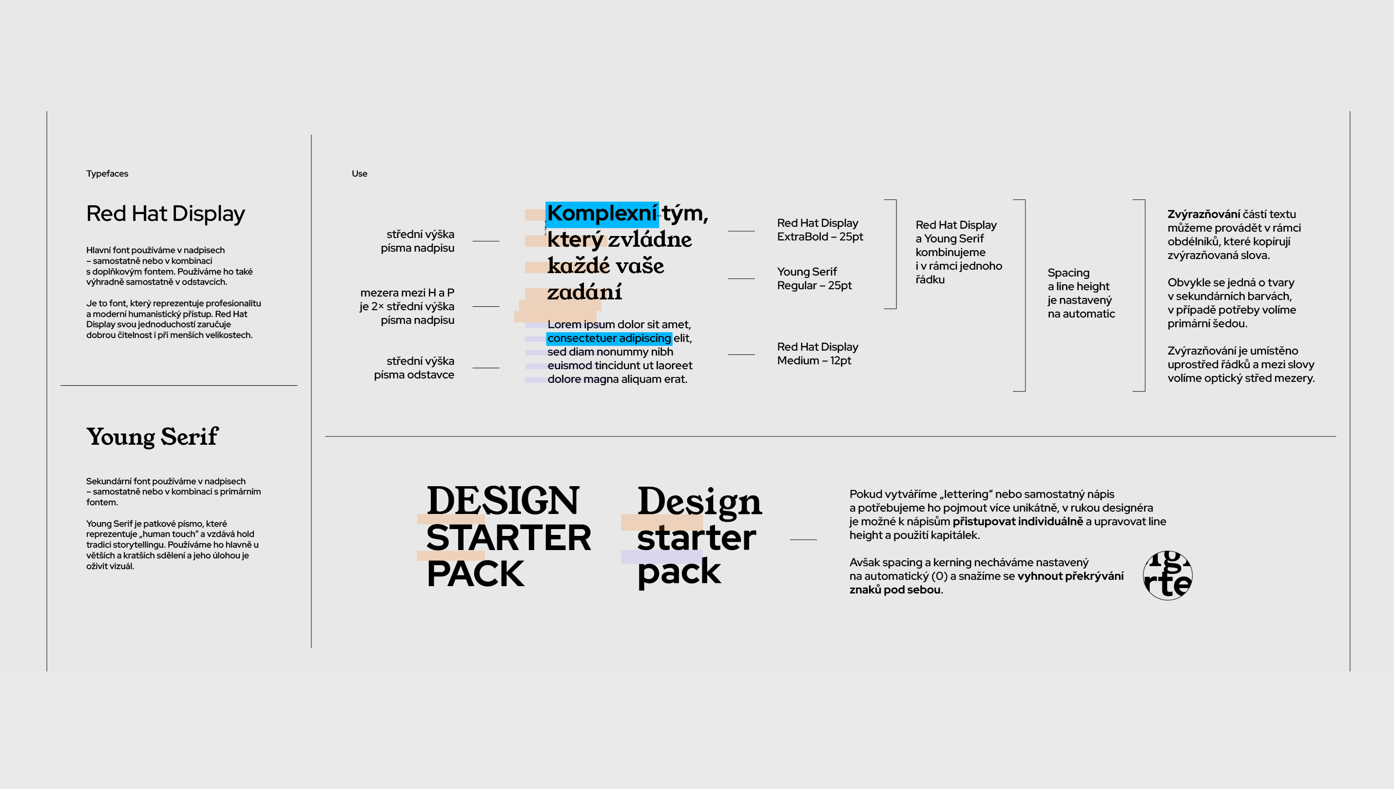
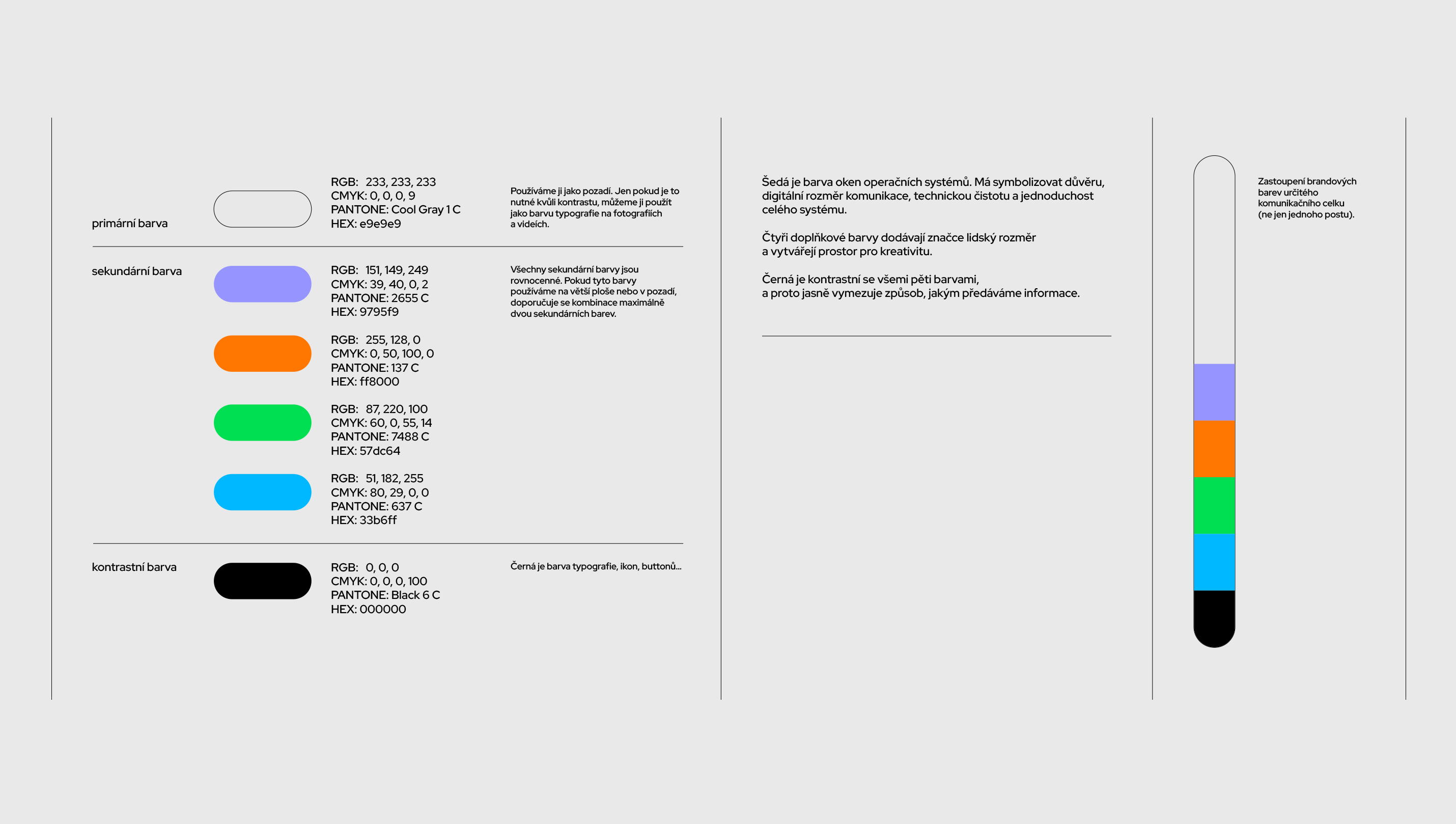
Four equally weighted accent colours and playful copywriting bring warmth to the system. The main typeface, Red Hat Display, conveys professionalism, while Young Serif adds a human touch and nods to the tradition of storytelling. The two typefaces complement each other seamlessly, so the communication feels both credible and personable.
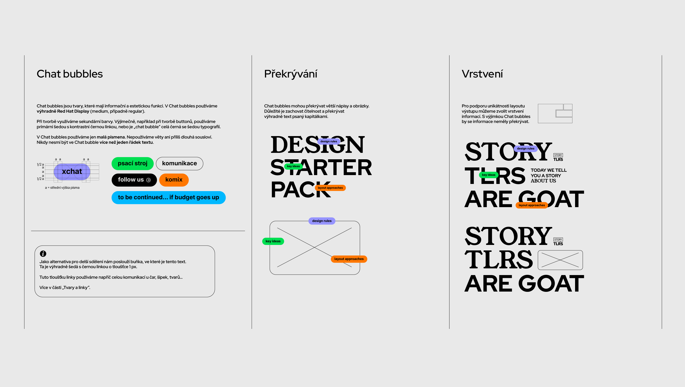
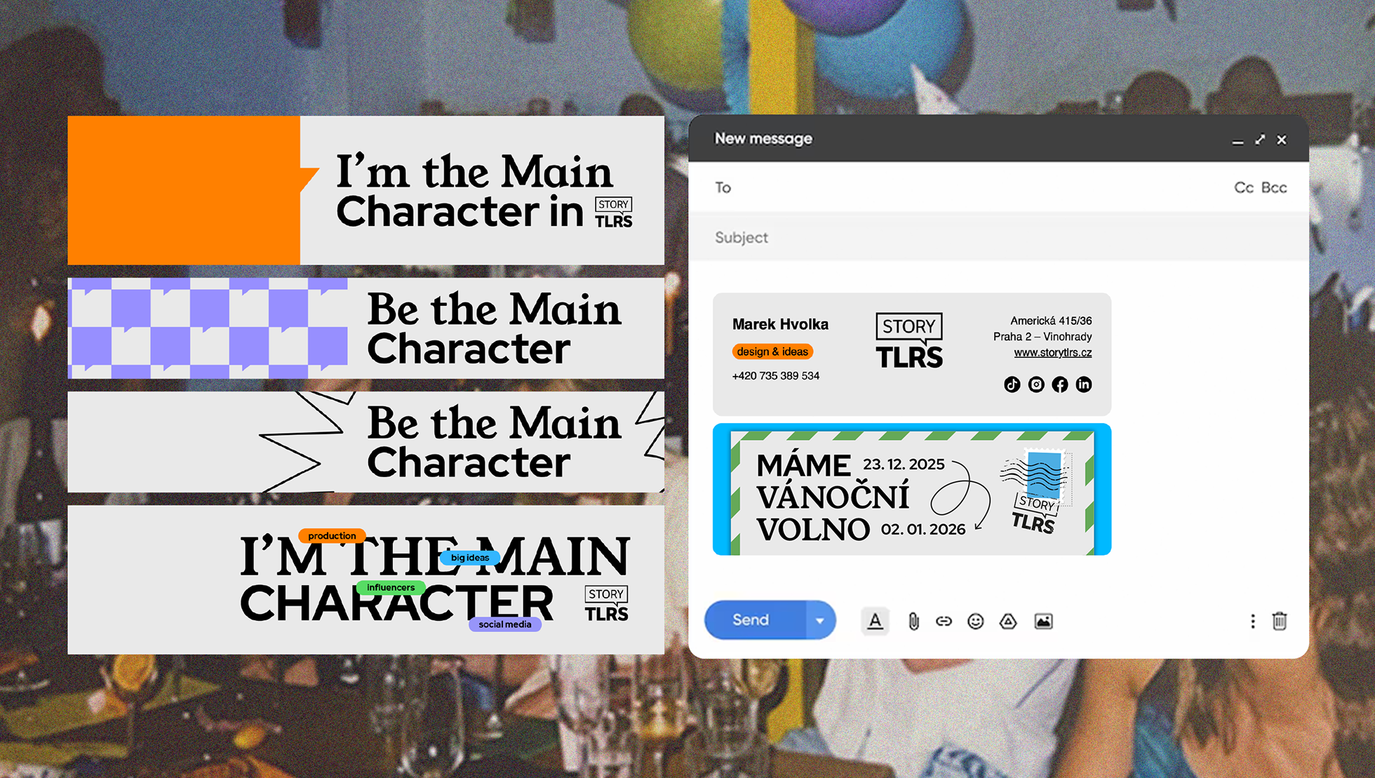
Chat bubbles tag content, add context and build a story around the key message. As they overlap and layer with the text, the visuals feel curious and dynamic. The rounded shapes draw on old television screens and the windows of computer interfaces, and we carry them over to photo masks, banners and slides.
A thin black line separates information and guides the eye. The system works across everything from a restrained two-colour design to more colourful, dynamic variations. This lets it connect serious materials with lighter ones, from client presentations to social media posts.
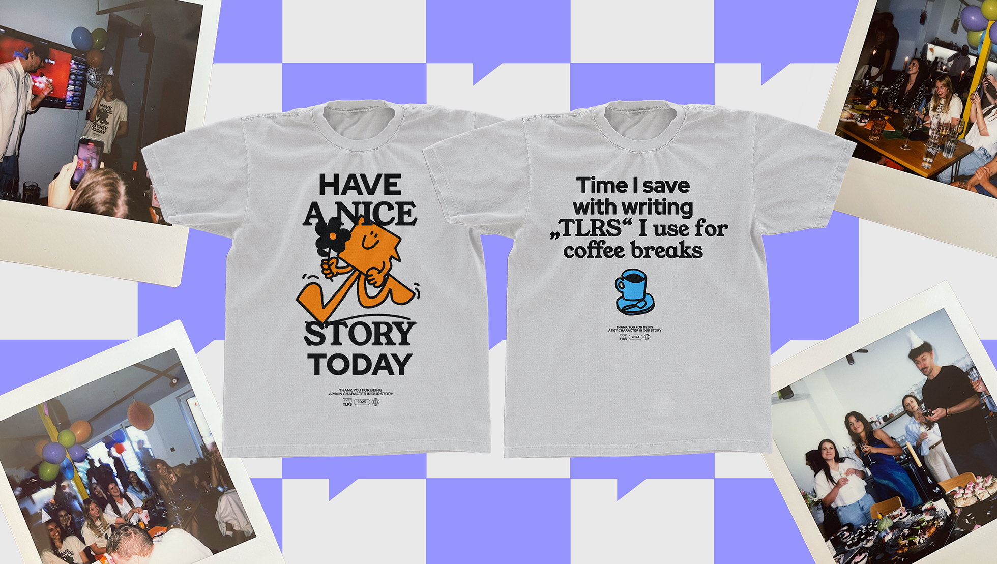
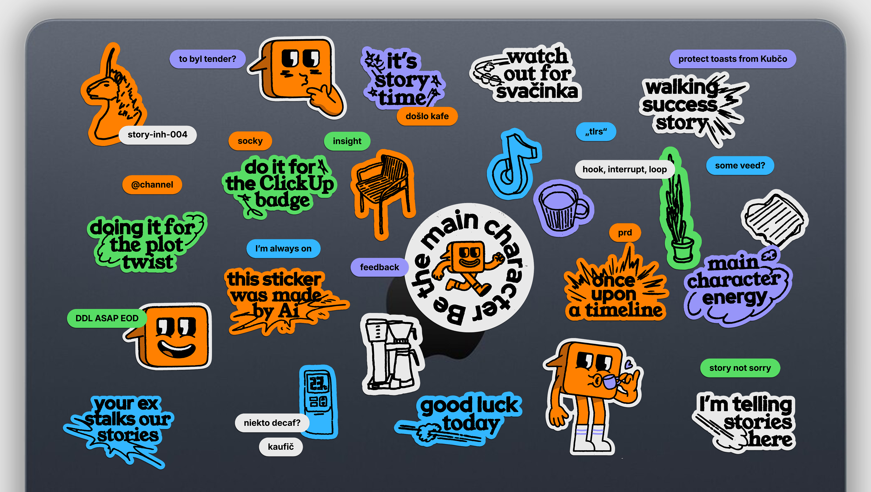
Storko, the mascot we created for the agency, is also part of the identity. Its body is shaped like a speech bubble, the brand's core code, and its eyes are quotation marks that point directly to storytelling. Together, they give the brand a face and personality.
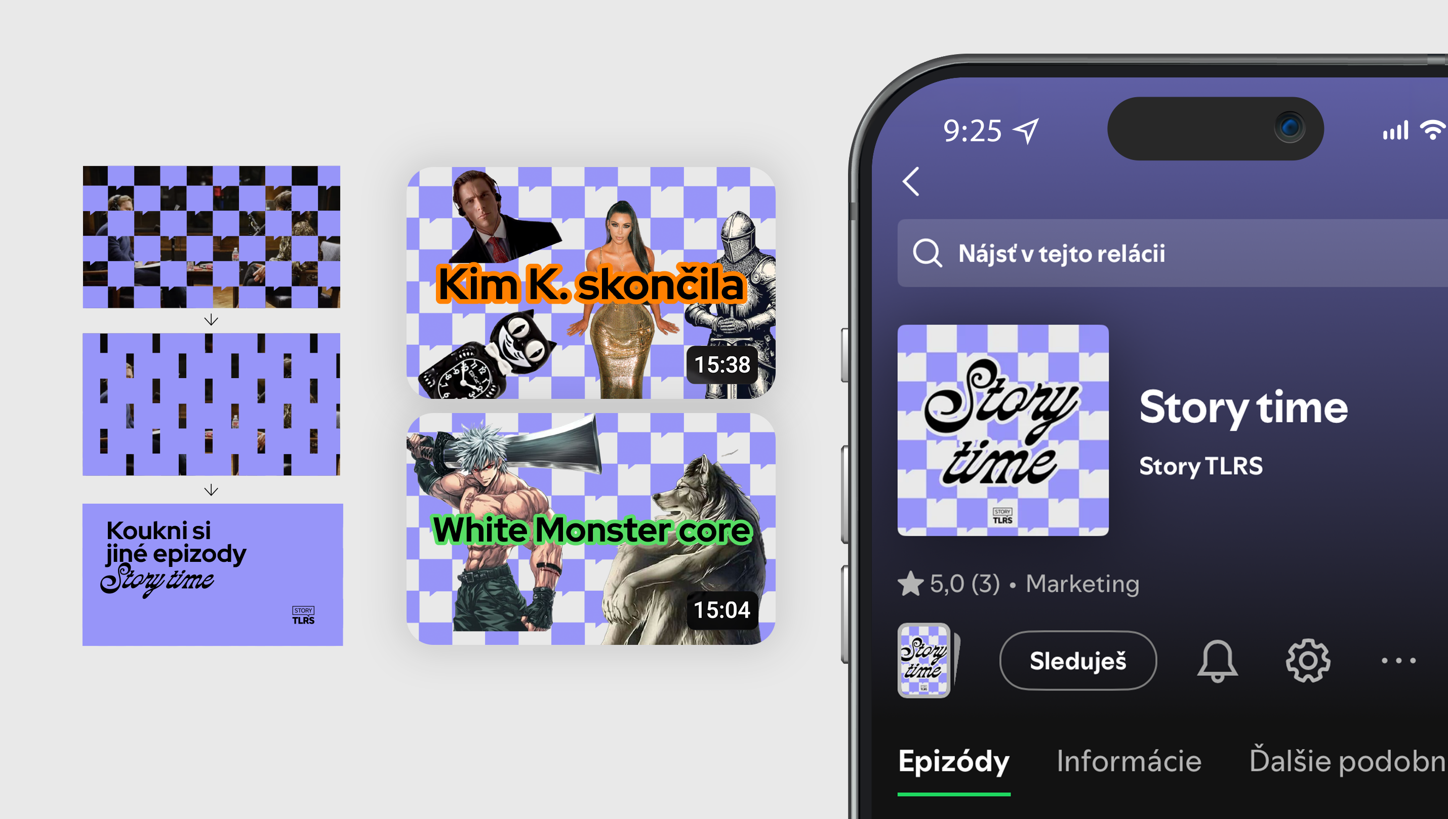
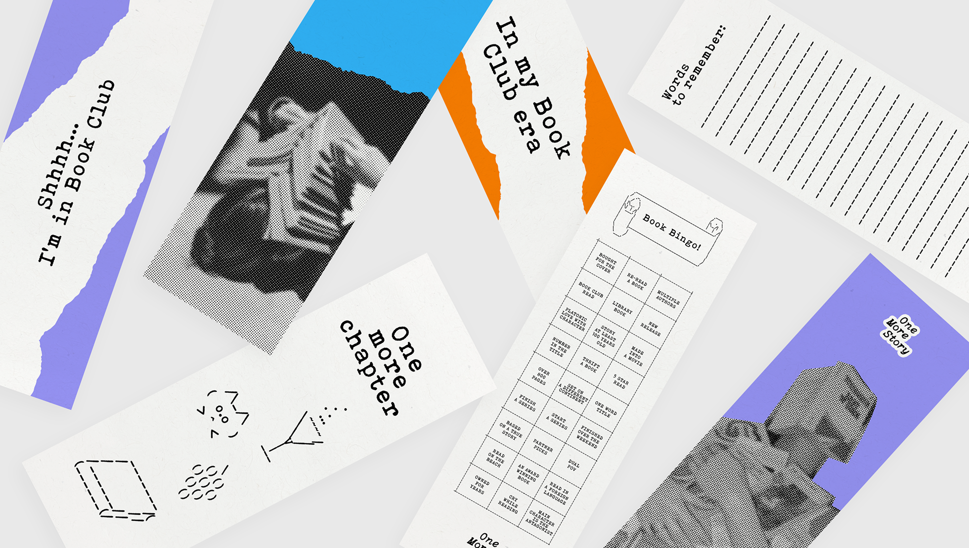
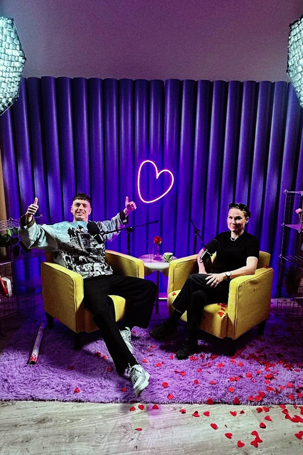
We extended the identity with two sub-brands. Story Time is a podcast in a more relaxed format, where the agency talks with marketing professionals about the latest trends and news in social media. One More Story Book Club brings together the team, people close to the agency and the wider public over a book they all read. For its offline meetups, we rearranged the brand codes into a visual system of its own.